
BI is short for business intelligence.
BI by definition means an interactive tool (colorful dashboard). BI tools should not be confused with the standard YouTube dashboard. The YouTube dashboard lacks the ability to integrate different data sets and offer an interactive experience.
Imagine you are watching a spy movie on YouTube. The FBI is trying to catch a criminal. After reviewing all of their activities for months, including past travel plans, spending habits, and places suspect lives, the FBI looks for data points that create a pattern of the suspects daily activities. Once this data is collected, the FBI can ask the question, “Where will the suspect be and what will the suspect be doing at 4p on Monday, October 30th?”
This page shows the differences between a common YouTube channel dashboard and how API data analysts see your data.
Note: the following examples are hypotheticals because all the data (OAuth API) we collect is propriety and belongs to the owner of the channel.
The best way for you to see and experience this data for yourself is to click the link below. It will take you to the authorization page. That page will explain the basic plan for $20 (1 time fee), so you can see your own data in a colorful format.
I have read the Google policy on privacy on this website and I understand my rights.
Click here: Yes, let me see my data. We will be redirected to our SIGN ME up page, which is a link to the official Google website for registration.
- If you are not signed into your Google account, do so before you click this link.
The first diagram below shows 2 standard line graphs from YouTube’s dashboard.
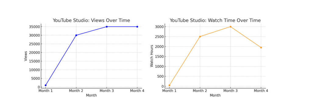
Notice, the graphs above show you basic information but they do not go into the bigger picture.
Many channel owners we talk to say, ‘I have reviewed my Youtube dashboard, but something feels missing. I know there must be much more data. I simply cannot make the best informed decisions based on this limited information.’
The details are below.
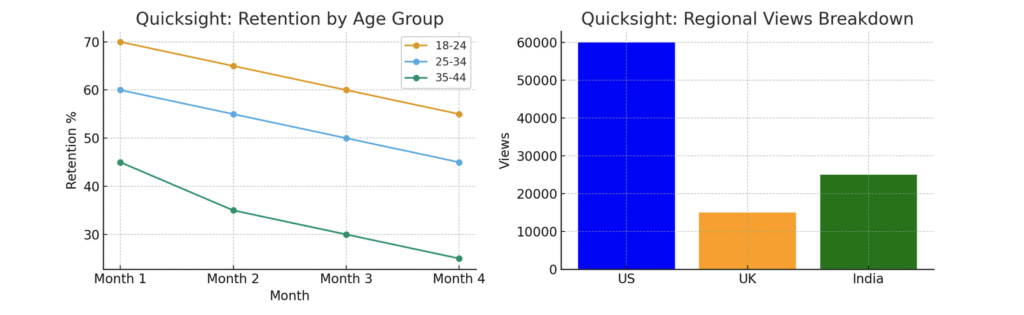
The next set of charts below are from Google Looker Studio. Notice, what you are looking at are only two graphs showing data points. The graph to the right is more telling because it answers the question: “What regions (locations around the world) are my viewers coming from?”
We can also do this with age ranges, and other metrics. In a few minutes of viewing these together, all the data can be merged to compare how different metrics work together.
Since all data is proprietary, the link below will direct you to Rick’s YouTube channel where he explains how this data is valuable to you.
How to qualify for a free viewing of your data.
Yes, i want to know if i can qualify for a free partnership.